

There’s a new trend in Google that is EXPLODING right now.
In fact, this trend is so important that Google has just changed it’s entire core ranking algorithm because of it.
If you take advantage of it, you can find yourself with more website traffic and better rankings. And if you ignore it, you’ll find yourself missing out on tonnes of traffic and enquiries.
With over 58% of all searches in Google being done from a mobile device, the time is now for your business to have a lighting fast and fully responsive mobile website that works for today’s customers.
3 practical ways to supercharge your mobile SEO, and get your site ready for Google’s mobile-first index.
In 2018 there will be over 2 and a half Billion people that have smartphones – that’s a third of the world’s entire population.
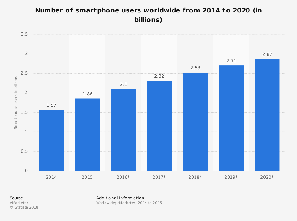
And according to Google last year there was over 27 billion more queries performed on mobile than desktop.
And this trend is only going to continue.
Mobile is now so important that Google launched 2 major changes to the way they rank websites in their algorithm.
Google’s 2-Step Mobile Plan
The first major step of Google’s mobile plan started when they rolled out their Mobile-Friendly Update which many people dubbed “Mobilegeddon”.
This new core algorithm boosted the rankings of mobile-friendly pages and devalued pages on your website that were not mobile friendly.
And guess what, Google’s not finished.
The 2nd stage of their mobile strategy is about to get underway.
They are switching to a completely ‘Mobile First” ranking algorithm – and if your website isn’t ready you could see a major drop in your website traffic.
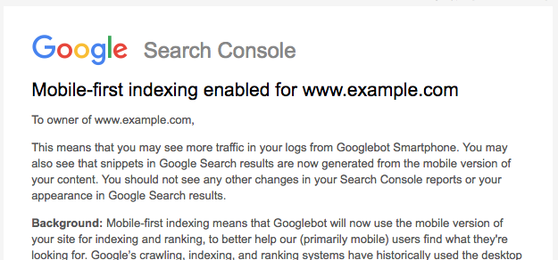
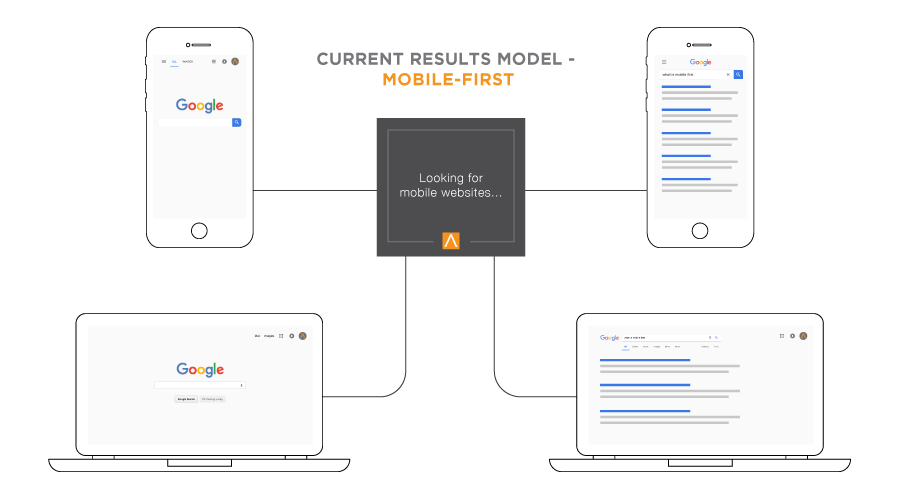
What Is Google’s Mobile-First Algorithm?
This new Mobile-first index will rank search results based only on the mobile-version of your page. This happens even if you’re searching from a desktop.
Why does this matter?
This means Google will now see your MOBILE website as the ‘primary’ version of your site.
Prior to this update, Google ran two indexes side-by-side: both a mobile and desktop version.
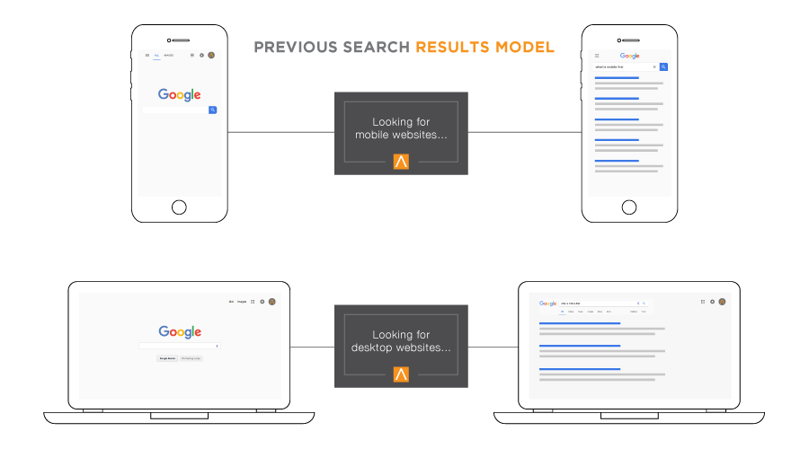
But now they will be using your mobile site as the first version they look at when considering where to rank your website in their search results.
If Google is taking mobile usability this seriously, then you should too. If you don’t address your website’s mobile issues, you may notice a rankings drop as Google rolls this new algorithm out.
But don’t panic, there are simple steps you can take to get your website mobile ready.
I’ve come up with 3 practical ways to improve your Mobile SEO so you can take mobile usability as seriously as Google.
By implementing these changes, Google will mark your site as ‘mobile-friendly’ and start sending more traffic your way.
Step 1 – Make Your Website Fast
The first step is to make your site FAST.
Your users expect your site to load lightning fast – especially on mobile.
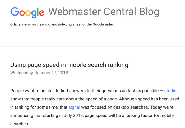
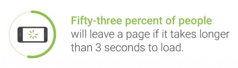
In fact, 53% of people will leave your page if it takes longer than 3 seconds to load.
A few extra seconds could have a huge impact on your ability to engage visitors and make sales.
As website speed is vital to your mobile SEO success you need a few strategies to cut your load times…
How To Speed Up Your Mobile Website
- Get a good web hosting company
- Squish your images for web – smaller file sizes are better and use JPG where possible and PNG only for transparent Background images
- Enable browser caching
- Enable file compression
- Minify and combine your files
- And use Google’s tools to test your page speed and follow their recommendations
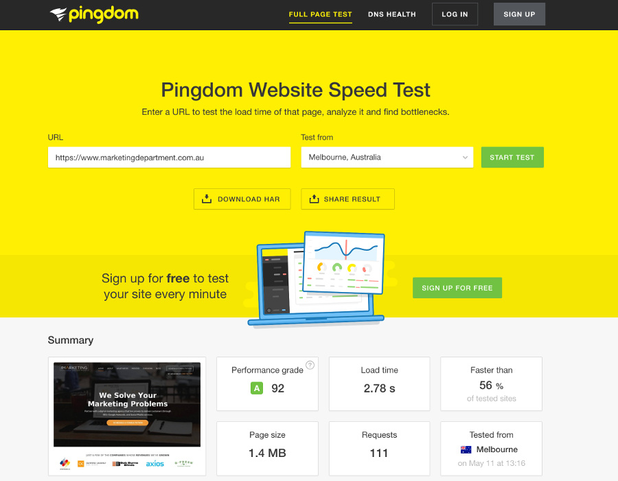
How To Check Your Website Speed
You can easily check your speed by putting your website URL into these websites.
Step 2: Make Your Website Responsive
The second practical way to improve your mobile SEO is to make your website fully responsive.
Why?
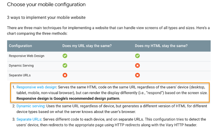
Simple, Google recommends you use a ‘responsive’ design and not a completely separate mobile site.
“Responsive web design” means that the page uses the same URL and the same code whether the user is on a desktop computer, tablet, or mobile phone.
The display simply adjusts or “responds” according to the screen size your customer is using.
So if you’re using WordPress, we recommend picking a responsive template that resizes the content based off the screen size that your customer is using.
If you’ve got a bit more time and money for your next redesign, we recommend starting off by designing a tailored mobile version of your site FIRST, and then creating your desktop layout.
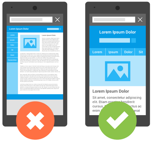
Step 3: Optimise Your Design and Content For Mobile Devices
The 3rd practical way to improve your mobile SEO is to optimise your design and content for mobile devices.
It’s super important that once your customers get to your website, that they can easily read and use it on their phones.
Remember, smaller screens mean less space for design elements – so use the space wisely!
Some best practice mobile design and usability tips are:
- Use plenty of negative or white space
- Font size easy to read with clear subheadlines
- Short punchy sentences, bullet points, font weights
- Split your content into small paragraphs
- Make images smaller so they don’t take up the entire screen
- Optimise tap buttons – use click to call and simple mobile navigation
- Add smartphone compatible videos
You now have 3 super actionable ways to improve your mobile SEO, and get your site ready for Google’s upcoming mobile first indexing.
Which ones are you going to implement on your site? Let me know by leaving a comment below!