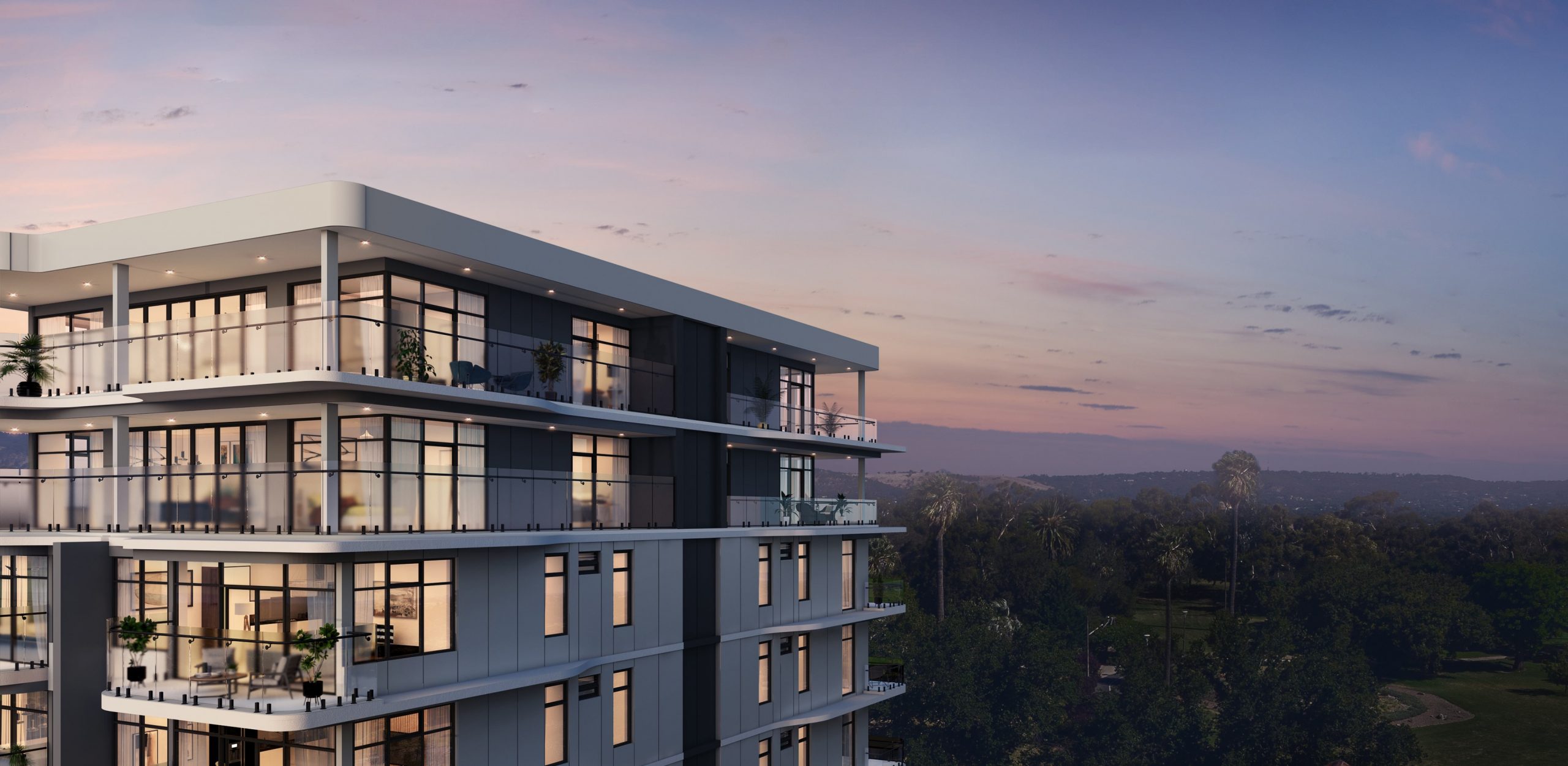
A boutique apartment complex in the heart of Adelaide
A unique identity
We drew on the close proximity to the Himeji Gardens and the sculptural articulation of the building to create an impactful brand for Paragon on the Park. The colour palette features the beautiful Turkish Rose and Golden Sands tones of the Cherry Blossom tree in bloom, which was further enhanced by the use of a textured background.


A refined experience
The logo itself was developed using a contemporary Serif hero typeface, accompanied by a contrasting light sans typeface. This create a sense of refinement that reflects both the location and luxury of the building.

Responsive, accessible and optimised
Our goal was to generate qualified buyers and nurture prospects through each stage of their buying journey, which was achieved through a fully responsive custom-designed website, tailored digital ad campaigns and personalised communication.

Responsive design
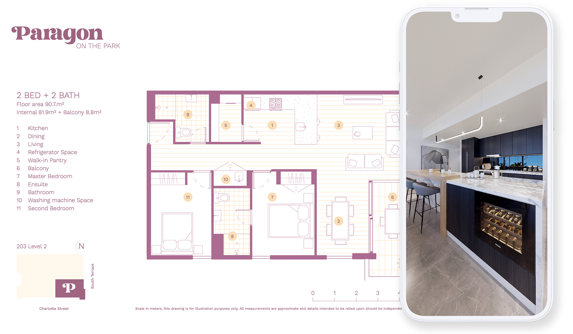
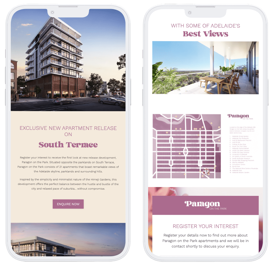
It was extremely important that prospective buyers and investors could access the Paragon on the Park website on all devices with full functionality.
We tailored the design to be fully responsive on all devices, while including repeated calls to action and a floating header.
This made it extremely easy to navigate and view essential property information.

© 2024 The Marketing Department